
In ALA: Where am I?
Just a thought from 8 August 2006 about
Design, Elsewhere, Writing.
Whoops, I did it again. I let a long-simmering annoyance with some quirk of current web design spill over into a rant that the kind folks at awesome web design rag A List Apart, enablers that they are, were kind enough to publish. Some will call it obvious, but if it was so obvious, it wouldn't be such a frequent problem.
Do What You Suck At
Just a thought from 16 June 2006 about
Design, Life, Writing.
In Merlin's latest 43 Folders podcast, The Perfect Apostrophe, he tells the story of the book he almost wrote. You should go listen to it - Merlin's a stitch, as always.
For the uninitiated, 43 Folders is a "Getting Things Done" blog about how to be more organized in business and life. When he and a colleague were invited to write a book about personal productivity, it was like a dream come true for Merlin. I'll let him tell you the story about what happened next, but suffice to say, the book never happened. The productivity expert procrastinated himself out of his own book.
"The fact is, I don't do this stuff because I'm good at it," says Merlin of his obsession with productivity. "I do this stuff because I'm really, really shitty at it."
Conspicuous Cobrandification
Just a thought from 4 June 2006 about
Amazon, Design, Internet.
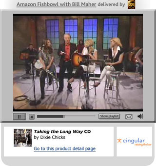 I went to Amazon today and was greeted by this thing at the top of the homepage. Apparently it's a "show" hoster by Bill Maher, produced by Amazon, to move product.
Now, I think it's great that Amazon is keeping Bill Maher behind a camera (just imagine the trouble he could get into in the real world). And I'm all for hearing a couple of tracks from the new Dixie Chicks CD (although it's so "adult contemporary" I could just plotz). But what's going on in Amazon's Filthy Lucre Department?
The Importance of Creative Procrastination
Just a thought from 22 May 2006 about
Design, Geek, Internet.
Coders and designers, we're from different tribes. Name any issue and we'll neatly divide into sides: form and function, information and experience, oil and water. Of course, no good website happens without both. So it's worth noting when we find a piece of common ground on our own.
Exhibit A: Deane Barker, writing at Gadgetopia. He's firmly planted on the code side of the equation, and recently wrote a post called "Are you procrastinating? Or are you just thinking?" about the importance of procrastination.
Sometimes, the worst thing you can do is start programming right away. Sometimes the best thing you can do is think about the problem - either actively, or just by letting it simmer on the back burner of your mind for a while.
I love what he has to say, and it mirrors my experience with design and writing. The hard part is the thinking that comes first, and that thinking often happens the background.
Continue reading “The Importance of Creative Procrastination” »
Back in Black
Just a thought from 18 May 2006 about
Apple, Design, Geek, Technology.
My first laptop was a black Apple Powerbook G3, aka the WallStreet. I dragged the ten pound sucker across Europe in a backpack. I've had many computers before and since, but this was the one I pecked out stories on while riding trains through the European countryside, the one I fell asleep next to in Amsterdam, the one I jacked into phone lines to dial home to check email. This was the one I loved.
 I've longed for a similar computer ever since. Black just seems to be the right color for a computer you're going to be traveling with. And the plastic was just more resilient than the easily dented metal Powerbooks that came after. In short, I've been waiting all this time for the computer that Apple just released.
Meet the new MacBook (formerly iBook). It's half the weight of my old WallStreet, same size screen, and so much faster I can't even imagine. And, yeah, black. So I went to see it in my local Apple store tonight and, frankly, walked away unimpressed.
What Would Google Do?
Just a thought from 15 May 2006 about
Design, Elsewhere, Google, Writing.
Google and I, we're old friends. I've written about them here and there for years. Google, as a web innovator, has done just about everything right.
But as a designer, I'm tired of hearing clients and associates ask, "What would Google do?" as if every move they make is pure gold. When it comes to visual/exerience design, Google does just about everything wrong, starting with their user-hostile homepage.
So I wrote a little something for the new web design magazine, Vitamin. It's intended to be opinionated, so it's okay if you have a different opinion. That's the thing about old friends - you're allowed to squabble every once in a while.
Calling All Designers: Learn to Write!
Just a thought from 9 May 2006 about
Design, Elsewhere, Writing.
I recently had the good fortune to work with a client who asked me to, in addition to doing my usual experience design / visual design thing, also write much of the text that appeared on the site. And it made me realize that I've often done this for clients - it just wasn't an official part of the process. It was more like, "well, somebody had to write it, and I knew what it needed to say, so I just kinda did it."
Having a client actually encourage me to use my words in addition to my pixels renewed my appreciation for the role writing has in designing good experiences online. Words are how we think, communicate, and create experiences every day. A designer without words is like a car without an interior: nice to look at, but I'd hate to have to drive it.
So I wrote an article for venerable web magazine A List Apart on this topic. If you, or someone you know, designs experiences for a living, give it a read and let me know what you think.
The Art of No
Just a thought from 2 May 2006 about
Design.
Being a designer is all about embracing the word "no." When we sit down with a blank slate and a job to do, we have to say "no" over and over again. Choosing a primary audience means saying "no" to all the others. Picking a task to enable means saying "no" to all the other possible tasks (or, at the very least, deprioritizing them). Selecting a font, a color, a photo ... almost every decision we make is about selecting the best option and saying "no" to the rest.
As a result, we can be a pretty grumpy bunch. We learn to be hard on ourselves and each other in design classes and reviews. Ask a designer about the design of something and we're emphatic. "I can't believe they chose that font," we'll say. "Anyone who would letterspace blackletter would steal sheep." "That photo ruins the page."
But what nobody ever teaches us is perhaps the most important thing you can learn to be a successful working designer: How to not say "no." If I could give one piece of advice to the designer just getting into client work, or even some who's been doing this for a while, it's this: The next time you want to say "no" to a client, boss, or colleague, say this instead: "Why?"
What I'm Up To Now
Just a thought from 26 April 2006 about
Design, Life, Powazek.
Two months ago, I posted about leaving Technorati and starting a design studio. I also lamented how hard it was to find a good domain name, and lots of you wrote in with fabulous suggestions and offers. I tried to reply to everyone, but please forgive me if I didn't get back to you. They were all great.
Here's the thing. Less than two months after starting the design company, things have shifted. I'm still starting a company with my good friend Paul, but it's transmogrified into something else. (Guess it's a good thing we never did settle on a name.)
The new company is going to be ... pure awesomeness. After years of putting designs to other people's visions, I'm finally going to be able to do it for myself. I've come up with lots of ideas over the years, but this is the first one that's got all the elements in line: the right time, with the right people, and the right technology. Plus there's an actual business plan.
The Wisdom of Browse
Just a thought from 20 April 2006 about
Design, Geek, Internet.
There's some drama afoot lately as bloggers pick apart Digg's user-controlled editorial system, looking for evidence of editors lurking in the darkness. But much of the conversation is overlooking a crucial nuance when it comes to authentic media and democratic editorial systems.
For the uninitiated, Digg is a tech news site, where the members post links to interesting stuff, and then the community chooses which links get promoted to the front page. For readers, this means they see stuff that a lot of people think is interesting, which is why the site is so popular.
Digg's members influence which stories get promoted by "digging" those stories. A digg is like a vote, and everybody gets one. How, exactly, a story winds up on the Digg homepage is never explicitly disclosed, but most people have assumed that the front page is simply a collection of the stories with the most votes. And, certainly, Digg has encouraged this view. Their about page simply says, "Once a story has received enough diggs, it is instantly promoted."
But a simple voting system is not necessarily the best way to provide an interesting experience for users. In fact, it might very well be the worst.
Design for Selfishness
Just a thought from 11 April 2006 about
Design, Folksonomy, Geek, Internet, Tags, Technorati.
In 1996, Paulina Borsook wrote a story that, frankly, really pissed me off. In "Cyberselfish," published in Mother Jones and eventually turned into a book, she wrote about how new have-it-your-way technology was creating a generation of spoiled brats with computers.
I took umbrage. Not only was I a proud member of the generation she was lambasting (a generation that is now oldschool on the internet, for whatever that's worth), but I had personally observed just the opposite. I witnessed people using new digital tools to collaborate. I saw more selflessness and altruism online than off. From the Open Source movement of the nineties to the mashup culture of today, I see a web that plays well with others. If the medium really is the message, I think the internet's core message can be summed up in one word: Share.
Nowadays, people get that a lot more than they used to, and there are a host of new companies built to enable this sharing. But I fear that, in our rush to embrace the contributory culture of the internet, this new crop of startups is forgetting one thing: Paulina Borsook wasn't wrong.
I Live in the Future
Just a thought from 23 March 2006 about
Design, ETech, Geek, Internet, Powazek, Technorati.
 So today I found myself at home, sitting on the couch, plugged into my laptop. I was talking to a gentleman in Australia, where it was already the next day, over the internet with Skype. We talked about the web, blogging, and community, while his daughter squealed in the background. He recorded the conversation and has now made it available to his listeners as a Podcast.
Is this what it's like to live in the future?
Four Themes from skinnyCorp
Just a thought from 15 March 2006 about
Design, Flickr, Geek, Internet, SXSW.
Another one of my favorite sessions at SXSW Interactive 2006 was Zero-Advertising Brands, where we got to watch Maggie Mason talk to the guys from skinnyCorp, the makers of Threadless among other creative commerce/community hybrids.
One of my favorite things about talking to folks that really get the user-generated web, is that when they tell you their secret recipies, it all sounds so easy. Here's George from Flickr in the Designing the Next Generation of Web Apps talk: "We listen to what our users say, and then iterate the design." See? Easy.
So when the guys from skinnyCorp opened their komono in the Zero Advertising panel to share their four steps to success, I took notes and made my own translations. Here goes.
What I'm Up To
Just a thought from 4 March 2006 about
Design, Geek, Internet, Life.
So I'm starting a design studio. Something small, specializing in participatory interactive projects - sites that do something. It'll just be me and a partner, at first. We've even got a small office space already, and an ever-growing list of clients. There's just one thing we do not have. A name.
I have spent the last month trolling whois every night. A good web company needs a good domain name, and lemme tell you, they're all taken. I mean, all of them. Even the sarcastic ones, the ones you look up even though you hate them. Makes a guy wanna make up a new word like "blog" or something.
So I'm wondering, dear reader, are you the kind of person who's sitting on a cool dotcom that you might be willing to part with? If so, drop me a line. I'm serious. You'll save me from the dysfunctional relationship I'm developing with the Whois Lookup.
More details on the company, whatever it's called, soon. For now, I'm doing what every serious dotcom businessman does to start off his business. I'm speaking at a conference. Hope to see you there.
Threaded
Just a thought from 1 November 2005 about
Design.
After being a member of Threadless for four years, I've finally submitted a couple of designs. And they're up! Now the voting and thrashing begins. Join in the fun!


Update: And the votes are in! Woof. Better luck next time.
Embrace your bottom!
Just a thought from 13 September 2005 about
Design, Powazek, Weblogs.
I mentioned this idea briefly when I posted about the recent redesign, but I wanted to expand it further. Web designers of the world, let's talk about your bottoms.
When you're designing pages - specifically content pages - what is the best possible thing that could happen? I mean after the user has bought a computer, gotten internet connectivity, figured out how to use a browser, and somehow found their way to your site ... what is the single best thing that they could do?
Read. That's right, read. And read all the way to the bottom of the page. In this business, a user that actually reads all the way to the bottom of a page is like gold. They're your best, most engaged, happiest users. You know, because they haven't clicked away. They did the best possible thing they could do, and now they're at the bottom of the page. And how do you reward them?
With a copyright statement. Maybe, if they're lucky, some bland footer navigation.
If you ask me, that's just rude.
The iPod nano: So perfectly tiny
Just a thought from 8 September 2005 about
Apple, Design, Geek, iPod.
 On the Cartoon Network there's a brilliant show called Harvey Birdman that recycles old Hanna-Barbera characters into a modern courtroom setting. One of the wilder side characters is Reducto, a little green man with a passion for all things small (voiced by none other than Daily Show's Stephen Colbert). Reducto is known for obsessing over tiny things, shrinking objects and people with his shrink ray, and using phrases like "perfectly tiny" and "wonderfully miniscule" and "magnificently dainty."
Why am I babbling on about a bit part on an obscure show? Because I'm the proud owner of an iPod nano, and this is an iPod Reducto would love. In fact, I'm convinced that it's going to turn perfectly sane people into raving Reductos.
Digging in the Dirt
Just a thought from 5 September 2005 about
Blogging, Design, Powazek.
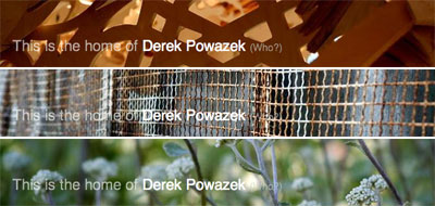
Your eyes do not deceive you - do not attempt to adjust your browser. You are looking at the latest redesign of Powazek dot com. I'd give it a number, but at this point, I've lost track of which version this is.
 I had two goals for this design. First, as much as I love the simplicity-rules 37 signals school of design, there comes a point when you just can't look at that much black and white Helvetica anymore. I'm all about the crisp and clean in my professional work, but this is a personal site and it should reflect the person behind it - and sometimes this person is a dirty, dirty boy. We don't all need to look like an advertisement for Swiss dentistry equipment.
Second, and this is something I've been percolating for a long time, I wanted to focus more on the page bottoms. Page bottoms are the most valuable screen real estate there is. You read that right. All that nonsense about people not reading and not scrolling is complete bullshit. Longtime readers will know this - I've ranted about it before.
Think about it this way: Sure, maybe only a small percentage of all readers will ever make it to the bottom of a page, but those readers are your most valuable. They read all the way to the bottom. They scrolled, even! When a reader reaches the bottom, they should be rewarded with a special treat - content, navigation, tools, whatever - not coldly abandoned the way most most sites do.
So new here is a wayfinding footer - the kind of stuff that's usually ignored in sidebars. Will it help people stay on the site and surf around? I don't know - you tell me.
I'm not done here. A good design is like a poem - it's never done, you just get to a point when you put it out there and hope people hear it like you meant it. So welcome to the new dotcom, same as the old dotcom, here until the next version rolls around.
Jon Stewart on The Couch
Just a thought from 20 July 2005 about
Design, TV.
Jon Stewart mentioned the Bring Back The Couch Campaign on the Daily Show tonight. He said:
Apparently there is a campaign ... to bring back the couch to the program. I've got some bad news. The couch ... died. It was surrounded by family. Assorted recliners and such. It was a terrible whoopie cushion accident. But it is no more. All of us would like nothing more than to have the couch back. Just know that the couch right now is being sat on by someone else who's dead.
The couch may be lost, but then again, so are the annoying animations behind the speakers that rolled out with the new set. And tonight, the blurry background images went away, too! Was the teasing from Billy Bob Thorton last night the last straw? Whatever the reason, tonight saw the return of the humorous images in boxes that I lamented losing last week. Smells like progress.
Oh yeah, also, the show was a fantastically sharp and and hysterically funny look at the John Roberts nomination, and exactly the thing I turn to them for every night.
What? I'm a designer. First thing's first.
Jon Stewart fans prefer Minima
Just a thought from 14 July 2005 about
Blogging, Design, TV.
Today I wondered what people were saying about Jon Stewart's new Daily Show set. So I did a Technorati search for "Daily Show" "Jon Stewart" "New Set" Desk Couch. The top three results were all within the last 24 hours:
The funny part is, while all three present differing opinions on the new set, they all use the same Blogger template. Jon Stewart fans prefer Minima?
Personally, I love the show and trust them to evolve it according to their vision. But I agree that the new backgrounds are distracting and I kinda miss the boldness of the foreground graphic overlays. Stewart always seemed uneasy when they got the laughs, though. ("Oh you like that pun, huh? Hmph.") Backgrounding and softening them seems to detract from their humorous punch.
As for the couch, yeah, I miss it. But it always seemed like an uncomfortable layout, the way guests had to sit all scrunched up on one side, twisting their necks to face Stewart. Is say: bring back the stools from the old MTV show! (Yes, I'm a longtime fan.)
Just don't stop doing what you do, Daily Show peeps. You're the best thing on television.
UPDATE: Just saw tonight's show. Hooray for the non-moving orange background during the first half. But did you see the menacingly enlarging Newsweek cover during the interview with Michael Isikoff? I literally had to look away to avoid getting dizzy. Please, Daily Show, chill out on the motion for the sake of motion.
And only six months late!
Just a thought from 2 July 2005 about
Design, Geek, Powazek.
It's my little tradition to redesign the ol' dotcom around the new year, just to keep things interesting. And today, I finally got around to it. For those playing along, yes, that's only six months late. A new record!
Being a remedial CSS student, the grey boxy design this site was sporting until about five minutes ago was my first real all-CSS design (for powazek.com, anyway. My clients always got the good stuff - cobber's children and all that). So this time I decided to try redesigning by only modifying the stylesheet. And that's what I did. Mostly. I wound up having to do a little in-template tweaking to achieve my favorite feature: the header and footer images.
I'm using the amazingly indispensable MTEmbedImage plugin for Movable Type to create a special background image for the headers and footers. It will update every time I update Ephemera. Neato!
In general I just wanted to bust out of the drab boxiness of the old design, and embrace the whitespace. The recent redesign of Plasticbag was an inspiration in this regard. White is the new orange.
There's more I want to do here, but I think I'll call it quits while I'm ahead. Hope you like it!
The New New Thing
Just a thought from 9 June 2005 about
Blogging, Design, Powazek, Technorati, Weblogs.
 Seven months ago, when I told my friends and family that I'd taken a job at Technorati, they all had one thing to say to me.
Cool! But, um, what do they do?
These people weren't rubes. My tribe are some geeky folks. Bigtime bloggers, hardcore nerds, and computer-enabled professionals all asked me this. And translated through my filter it said one thing loud and clear: Houston, we have a problem.
I answered their questions as best I could, but I decided then and there to make it my life's goal to do everything I could to make it so that I never, ever have to answer that question again. The site should explain what it does, not the people who work there. Today we took the first step toward that goal and released the new Technorati beta.
This is a huge revision to the site, and the product of some of the most talented people I've ever had the pleasure of working with. I'd especially like to call out Jason DeFillippo who was literally coding with bandages on his fingers, and Ben Jenkins who came on a month ago and has been our ace in the hole ever since. Thanks also to CSS jedi Eric Meyer and illustrator extraordinaire Chris Bishop for lending their talents. And of course the real heroes are the engineers and ops crew who make it so people like me have something to design at all.
But enough with the acceptance speech. There are a ton of changes in the new site. In fact, just about every bit of frontend code has been rewritten. And all toward the goal of making the blogosphere more understandable, more fun, and more accessible to people who don't even know what a blog is.
I'd say more, but right now I'm so tired I'm literally about to fall over. So just go check it out. And, of course, that "beta" slug up there is on purpose - we're still working the bugs out and there's lots more in store. But please do check it out and be sure to let us know what you think.
And now I must sleep.
Redesign madness
Just a thought from 19 April 2005 about
Blogging, Design, Internet, Weblogs.
Caroline strips down her old site and relaunches at Each Man. (Aside to Caz: I got the reference.) Tom goes minimal with Plastic Bag. (Aside to Tom: Bold, confident design. Props!) I'd say there was a trend here, except that Matt just took his previously stripped-down A Whole Lotta Nothing and layered on the CSS lovin, complete with girly dropcaps. (Aside to Matt: Don't worry, I know you're all man.)
Anyway, redesigns are in the air. Makes me wish I had the time to give the ol' dotcom a fresh face, but, well, my redesign energy is being directed elsewhere right now. More on that soon.
Reinfected
Just a thought from 21 September 2004 about
Design.
Freelancing is like a virus. Once it enters your bloodstream, it never really goes away. It just goes dormant now and again.
I was a freelancer during the heyday of the web in San Francisco. From 1997 to 2002 I lived the freelance dream. I took meetings on the phone in my bathrobe. I worked when I wanted, and didn't when I didn't. It was wonderful - and not just because I was my own boss.
It connected me to my neighborhood in ways I'd never imagined. When you walk into your local coffee shop at 2pm on a Monday, you're not one of the working stiffs - you're one of those people they wonder about. What are they doing in there at this hour?
Out of Tune
Just a thought from 28 April 2004 about
Apple, Design, Geek.
I'm a randomizer. Back when my music came on small reflective circles, my favorite thing to do was load up the 5-disc changer with CDs from totally disparate genres and hit the shuffle button. Hours of tunes, bouncing between styles.
Now, admittedly, this is not everyone's cup of tea. I'm sure there are many people that pick an album, play it from top to bottom, and then pick another. But the great strength of digital jukeboxes are the many ways you can mix up your music library.
Apple's iTunes is especially set up for randomizers like me. Which is why one part of the new version released today is so disappointing.
The "Kostroversy" Context
Just a thought from 5 April 2004 about
Blogging, Design, Internet.
Something interesting happened this weekend. But it's not interesting for all the reasons it seems interesting at first.
Markos Moulitsas Zúniga is a political blogger. He maintains a site called the Daily Kos, where he writes thousands of words a day about Amercian politics, especially Bush and the war in Iraq. His politics are left of center, but not all that radical by San Francisco standards.
On Thursday, April 1, Markos posted a comment on his site: "I feel nothing over the death of merceneries. They aren't in Iraq because of orders, or because they are there trying to help the people make Iraq a better place. They are there to wage war for profit. Screw them."
The response was swift.
Wha?
This section is called Just a Thought. It's a blog where I post little pieces of what I'm thinking about at the moment. This page shows thoughts about Design, including:
In ALA: Where am I?
8 August 2006
Do What You Suck At
16 June 2006
Conspicuous Cobrandification
4 June 2006
The Importance of Creative Procrastination
22 May 2006
Back in Black
18 May 2006
What Would Google Do?
15 May 2006
Calling All Designers: Learn to Write!
9 May 2006
The Art of No
2 May 2006
What I'm Up To Now
26 April 2006
The Wisdom of Browse
20 April 2006
Design for Selfishness
11 April 2006
I Live in the Future
23 March 2006
Four Themes from skinnyCorp
15 March 2006
What I'm Up To
4 March 2006
Threaded
1 November 2005
Embrace your bottom!
13 September 2005
The iPod nano: So perfectly tiny
8 September 2005
Digging in the Dirt
5 September 2005
Jon Stewart on The Couch
20 July 2005
Jon Stewart fans prefer Minima
14 July 2005
And only six months late!
2 July 2005
The New New Thing
9 June 2005
Redesign madness
19 April 2005
Reinfected
21 September 2004
Out of Tune
28 April 2004
The "Kostroversy" Context
5 April 2004
Join the POWlist
Enter your email address here so I can send an occasional note to your inbox. Only good things, I promise. More info »

Working the web since 1995, Derek Powazek is the creator of many award-winning websites, a couple of which still exist. Derek is the cofounder of JPG Magazine and the CCO of 8020 Publishing. Derek lives in San Francisco with his wife, two nutty Chihuahuas, a grumpy cat, and a house full of plants named Fred. More »
Join the POWlist to receive the occasional note.

In ALA: Where am I? 8 August 2006
Do What You Suck At 16 June 2006
Conspicuous Cobrandification 4 June 2006
The Importance of Creative Procrastination 22 May 2006
Back in Black 18 May 2006


| My California Contributor (Story) |
|
| We Do Contributor (Photos) |
|
| Design for Community Author (Tech) |
|
| San Francisco Stories Author (Stories) |
|
| We've Got Blog Contributor (Essay) |
