| |
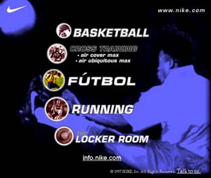
Nike needed a homepage that was modular – pieces needed to be easy to swap in and out. I chose to use black and blue here and go for a slightly more elegant feel because the rest of the site is so loud. It's just a menu, but it's a pretty menu.
This design was up for five months at the end of 1997, it came down in the beginning of 1998. |
|
 |