| |
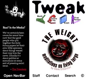
I created Tweak almost three years ago. It was my first stab at designing a web magazine from the ground up, and it taught me a lot about how to do it ... and how not to.
Here, on the homepage, I designed it so that, while we could use a graphic to tease a feature story, we also had space for some introductory copy. This establishes the voice of the site right up front. |
|
 |