New Powazek Design
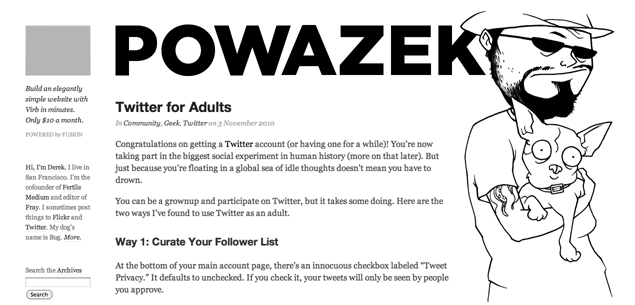
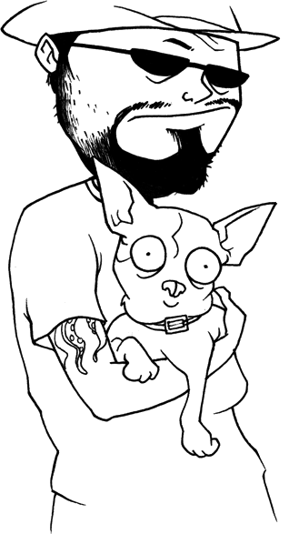
So as you may have noticed, there’s a new design here on the ol’ dotcom. As much as I loved the previous blue design, I wanted to do something with a little more personality. And when Adam Ellis did an illustration of me and Bug, it was just the inspiration I needed.*

The design is intended to be flexible, but it looks best on wide displays. If the screen is more narrow, the column width narrows and the illustration overlaps the word “Powazek” until it finally dips below it. I need to do a little more work in this area, but I’m happy with this technique for now.
I also wanted to challenge myself to make a mostly monochrome design. The ads are color, as are the hover states on links, but otherwise it’s all black and white. I have to thank John Gruber for the link treatment idea. I’ve always like the way he handled underlines and hover states.
This design features the most sparse footer the site has ever had. As usual, do as I say, not as I do. Besides, if you can’t break rules on your own site, where can you?
Comments are still off as I contemplate how to enable feedback mechanisms that don’t make me want to curl up and die. But I am experimenting with Twitter links at the bottom of posts I want responses to, like so.
*Adam’s excellent illustration was based on this photo by my lovely wife.

