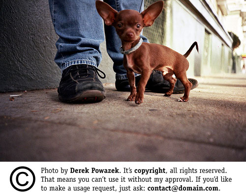
An Update to a Savvy Approach to Copyright Messaging
In my original post, I suggested adding a copyright message to a photo and use CSS to crop its view. This accomplishes the goal of adding robust copyright information without defacing your own work. I got a lot of responses to this idea, and wanted to update the post with a few responses to the most frequent questions.
1. It’s not semantic!
True. Neither am I. I once slung spacer gifs with the best of them, too. Good thing Heather likes the bad boys.
2. This won’t stop people from cropping it out.
True. Bad actors will always be bad actors. But that’s not the problem I’m trying to solve. The problem I’m trying to solve is how to add visual copyright information to a photo (which photographers want) without cluttering the display on the page (which I want). This is a simple way to do that.
3. Images don’t appear in my feed reader / mobile browser / printout.
True. Thankfully, there are smarter geeks than I. Commenter Dan Sandler posted an iteration of my technique (dubbed “PIFT” which is fantastic, especially when said out loud like “pfft!”) which puts the photo in a good ol’ IMG tag inside a DIV that crops it. Like so:
Code:
<div style=”height:123px; width:234px; border:1px solid #000; overflow:hidden”><img src=”image-url” title=”Title goes here.” alt=”Alt goes here.” /></div>
This way, the photo is available in all browsers, and we just use the DIV to crop its display. If a browser doesn’t support that CSS (because it was released when dinosaurs roamed the Earth), then the copyright just shows. Smart. Thanks, Dan!
4. This isn’t new!
I never said it was. For web dev folks, of course this is not a revelatory idea. CSS 1.0 could do this last decade. But many online photographers probably didn’t know about it. I just wanted to suggest a technique they might employ before the next copyright freakout.
5. No, sir. I don’t like it.
Then don’t do it. It’s a big web. There’s room for all of us.

