If Elected, I Will Not Serve
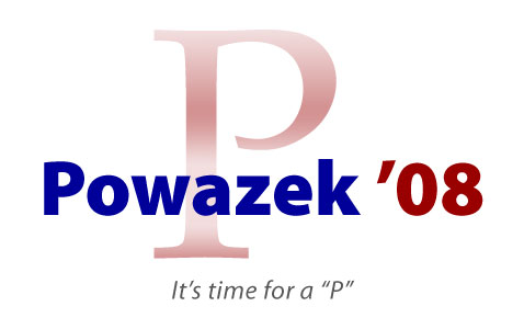
After studying the pearls of wisdom in Reading Tea Leaves and Campaign Logos in the NY Times, I started to wonder what a POWAZEK ’08 poster would look like. So, here it is. Given the field, I think I might actually do okay in the primaries.

For what it’s worth, my favorite logo of the current field is Obama’s. The white background and clean typography is lovely. There’s something feminine about it – and not just because the logo is a big “O”.
But the logo is vexing. The design is elegant, but it’s just a little bit too simple. The roundness makes it look like a padlock, or a purse. If I were the art director, I would have said “good idea, take another pass.” I would have liked to see them break the perfect circle, just a bit.
But what do I know – my campaign poster is a big pee joke.
