
Hey Apple, Don’t Make Me Think
As an official Apple Fanboy and Interface Geek, I have a complaint about the recent iteration of Apple’s iPhone software (1.1.3).
On the iPhone, the web browser is called Safari, just like on the Mac. This sameness is reinforced by the visual design of both applications. But in the new iPhone software, when they added a search icon, they did it on the left, instead of the right, which puts it out of sync with its desktop cousin.
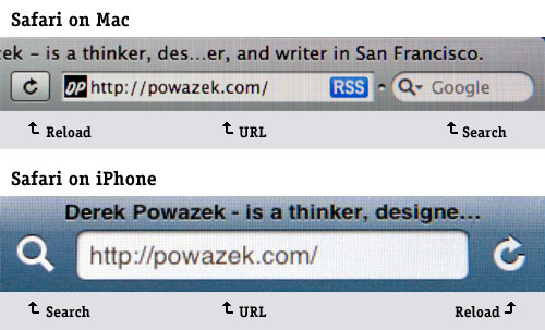
I know it sounds like a small difference, but small differences add up. Now, when I think I want to search the web, instead of instinctively going for the right side of the screen (like on the Mac), I have to go for the left. Apple has added a layer of decision-making, and any interface designer will tell you, these little additions add up.
Everything is so well thought-out on the iPhone, and the design of the iPhone OS and the Mac OS X is so harmonious, I have to assume there was some reason they did this, but for the life of me I can’t figure out what it is.
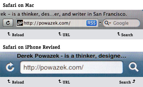
To be clear, this is how I think it should be. Although now, the change would be so disorienting, I can’t see it happening.
Here’s another one. When I think, I want to change my music on my Mac, I click the thing in the doc that says “iTunes”. But on the iPhone, when I click “iTunes” I get the iTunes wifi music store. On the iPhone, I have to tap the thing that says “iPod” to get to music. Confusing. It’s like having to click the “Mailbox” link on my mailbox in order to get mail. (Fortunately the 1.1.3 update finally allowed me to move iTunes to a secondary home screen so I could stop looking at it.)
As our computing experience breaks free from the bounds of the desktop computer and moves into everyday devices, consistent placement of major interface tasks is going to become very important. It’s a testament to Apple that this particular inconsistency stands out as a rarity in an otherwise perfect harmony of interaction deliciousness.
(BTW, the title of this post is a reference to Steve Krug’s required-reading book for web interface designers, Don’t Make Me Think.)